Soft Pastel Color Studio: what it does, and how accurate it is
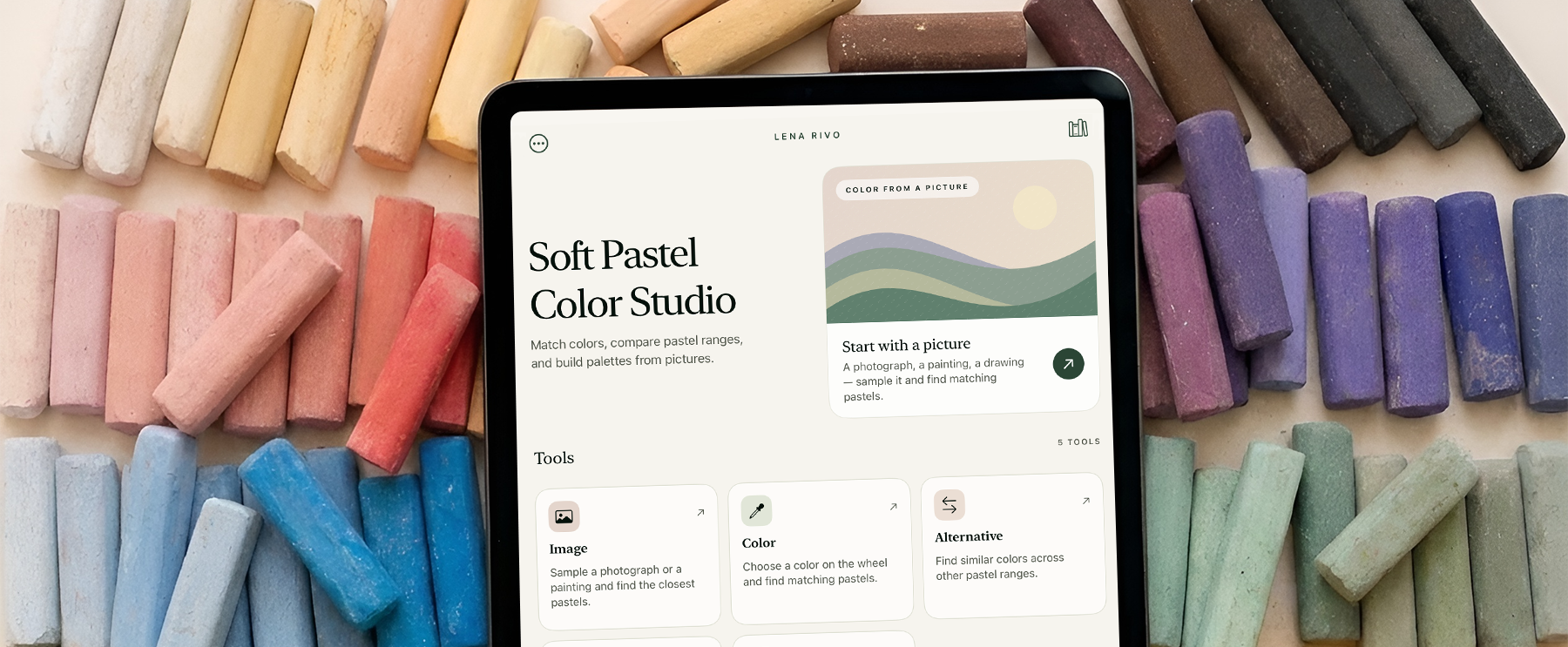
23 soft pastel brands, 7,826 sticks, compared in one place.
I'd like to introduce Soft Pastel Color Studio, a free app that can be helpful for soft pastel artists. The idea for it came out of my own work: when I started painting in soft pastel, my collection grew quickly — a set at a time at first, then single sticks, then whole ranges I wanted to try.
One of the things I find most wonderful about pastel is the sheer number of colors it comes in. Each brand has its own philosophy, its own approach to color, and the ranges differ greatly from one another. Some offer a few dozen sticks, others many hundreds. Nothing had to be mixed: the color was already there, made by someone who had thought about it carefully.
The same abundance turned out to be difficult to live with. Sticks lose their wrappers, numbers are small or missing, and no one can hold several hundred colors in their head. I made swatch charts, like most pastel painters do, and after a while I began gathering the ranges properly — all of them, in one place, so that any color could be compared with any other.
That is how Soft Pastel Color Studio came about. It holds the color ranges of 23 soft pastel brands — 7,826 sticks — and lets you compare them with one another: which colors each brand makes, where those colors overlap, and how close or how far apart they are.
It answers questions that are hard to answer any other way: Which pastel matches this color in a photograph? Which stick from another brand comes closest to the one that has run out? How many variations of a particular color exist across the ranges, and which of them do you already own?
This post describes what the app does, tool by tool, and how it decides that two colors are close. At the end there is a test: three sticks were taken, the app was asked for their matches in every brand, and every match it named was drawn by hand on paper. The tables show both — what the app says and what the pigment does.
Soft Pastel
Color Studio
Match colors, compare pastel ranges, and build palettes from pictures.
Step by step The tutorialEvery tool shown in detail, with live controls you can try as you read.
Start with a picture
A photograph, a painting, a drawing — sample it and find matching pastels.
Image
Sample a photograph or a painting and find the closest pastels.
Color
Choose a color on the wheel and find matching pastels.
Alternative
Find similar colors across other pastel ranges.
Palette
Turn a picture into a practical pastel palette.
Harmony
Explore complementary and related color combinations.
Why it exists
A painter working in oil or acrylic usually knows their paints by name and number, and knows how one differs from another. With soft pastel this is much harder. Many pastel painters make swatch charts and write down numbers for exactly this reason: when a stick runs out, they want to buy the same one again, or something very close to it.
There is another common situation. A painter may notice that a particular color keeps coming back in their work — say, a muted, yellowish color that is neither ochre nor yellow, a complex color that is useful for warm shadows. Having found it in one brand, it is natural to want to know which other brands make something similar.
In principle this can be done by visiting each manufacturer's website and opening its color chart. In practice, looking for one specific color across many brands this way is very difficult, and comparing a color in one brand with colors in another is almost impossible.
Pure, unmixed pigments tend to look very similar from one brand to the next: a cadmium red from one maker will usually be close to a cadmium red from another. But as soon as colors become complex — and complex colors are exactly what makes professional soft pastel so rich — the differences between brands become significant.
That is the situation I built the app for.
How it came about
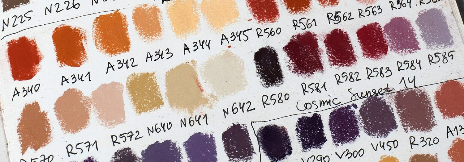
The first tool I made was Alternative: choose a stick from one brand and see what the other brands offer in its place. That was the whole of it at the start. Once I had the colors organized and could compare them in any direction, the other tools followed — working with photographs, building a palette for a whole image, exploring color harmonies. I did not set out to make those; they grew out of the same data, as new ways of using it.
Prismacolor NuPastel
204-P
Sandalwood
The brands
The app currently holds the ranges of 23 soft pastel brands, 7,826 colors in total:
Art Spectrum Soft · Blockx Soft Pastels · Blue Earth · Conté à Paris Soft Pastels · Daler-Rowney Artists' Soft Pastels · Diane Townsend Soft Form · Faber-Castell Creative Studio Soft Pastels · Girault · Great American · Holbein Artists' Soft Pastels · Jackson's Handmade Soft Pastel · La Maison du Pastel · Mount Vision · Mungyo Gallery Extra Fine · Mungyo Gallery Hand Made · PanPastel · Prismacolor NuPastel · Rembrandt · Richeson Handmade Soft · Schmincke · Sennelier · Terry Ludwig · Unison Colour
I have included only colors that are currently in production. Discontinued sticks are not offered as results.
Choose brands to compare
23 brands · 7,826 colorsOnly colors currently in production are offered as results.
Who it is for
The app can be useful for soft pastel painters at any level, from someone with their first small set to a painter with hundreds of sticks.
find which pastels correspond to a color in a photograph or a painting;
find a color you have in mind within one brand or several;
find a replacement for a stick that has run out or is hard to buy where you live;
see how many variations of a favorite color exist across different brands;
see how an image could be simplified and painted with a limited set of sticks;
see how much of a particular image you could paint with the pastels you already own;
find complementary or other harmonious colors within one brand or within your own collection.
Library: your own pastels
Before starting, it is worth telling the app which pastels you own. Many painters already make swatches of every new stick they buy, and these swatches make this step easy.
Open Library, tap Add Pastels, choose a brand and select every color you own by its number. Your pastels are then shown grouped by brand, and you can return at any time to add new sticks.
Once your collection is entered, the app knows exactly which pastels you have. In every tool that searches for colors, any suggested stick you already own is marked In Your Box. Palette can build a palette from your own sticks only, and suggest which sticks you are missing. Harmony can build color schemes from your collection instead of a single brand.
Girault
9Schmincke
6Image: a color from a picture
Upload a photograph or a picture of a painting — your own work, a work by another pastel painter, or a painting in any other medium. The medium of the original does not matter. You can crop the image if you are interested in only one part of it.
Then tap anywhere in it. I did not want the app to read a single pixel, which in a photograph is often just noise; it reads the average of a small patch around the point you tapped. That gives a color much closer to what the eye actually sees in that area.
Next, choose where the app should look: all brands, only the ones you are interested in, or only the pastels in your own collection. Each result carries a match rating — Almost Identical, Very Close or Close.
The results depend on the size of each brand's range. The more colors a brand offers, the more likely it is to contain a truly close match. A brand with a small range may have nothing close enough; in that case the app says so directly.
Prismacolor NuPastel
Best firstRembrandt
Best firstSchmincke
Best firstTerry Ludwig
Best firstUnison Colour
Best firstGirault
Best firstColor: choosing a color on the wheel
If you selected a color in Image, it appears automatically on the color wheel, where you can adjust it by hand: hue, saturation and value, with the sliders or directly on the color field.
Color also works without a photograph: choose a color on the wheel, then choose the brands whose ranges you want the app to search. The app works with real pastels, each tied to a brand and a catalog number, so colors are chosen on the wheel rather than entered as digital color codes.
Drag the ring or move inside the square.
Alternative: the same color in another brand
Alternative was the first tool I made and it is still the one I use most. It helps you find substitutes for a specific pastel.
Choose a brand, then a color from that brand by its number. Next, choose the brands you want to compare it with. For each of them the app shows up to three of the closest colors, each with its match rating.
Only colors that are close enough are offered as alternatives. If a brand has nothing close enough, the app says so directly and shows its nearest color for reference only, clearly marked Not a match. I did not want a weak match ever presented as a good one.
Even so, a match rating is a guide, not a guarantee. A color marked Close may belong to the same family and still look slightly different, and this happens more often in brands with smaller ranges. The good news is that you can trust your eyes: if a swatch in the app looks different from the color you are looking for, the stick will look different too. What looks close on the screen will be close in your hand.
This is useful when you have run out of a stick, when a brand is hard to buy in your country, or simply when you want to know how many variations of a favorite color exist across brands.
Prismacolor NuPastel
265-P
Ultramarine Blue
Palette: pastels for a whole image
Palette shows which sticks you could use for a whole image, either from one brand or from your own collection.
If you choose a brand, you also choose how many sticks the image should be broken down into: 12, 24, 36, 48, 120 or 250. The app divides the image into areas of color and rebuilds it shape by shape, like a puzzle, with each shape filled by one real pastel. In general, a larger palette gives a more accurate result, and the size of the brand's range matters too: a brand with several hundred colors gives the app far more options than one with a small range. Below the image, the app lists every stick it used, with its number and a swatch, and you can tap any area to see which stick represents it.
If you choose My Sticks, the app works with the pastels you have added there. If your collection holds, say, 300 sticks from different brands, the app picks from those 300 the ones that best suit this particular image and lists them below, so you can see how closely you could paint it with what you already have. If some colors are missing, it suggests which sticks could fill the gaps.
 Drag anywhere
An important note about layers
Soft pastel is rarely applied in a single layer. Painters usually build a color by laying one pastel over another, and a great deal of the character of a pastel painting comes from these layers and from subtle transitions between colors.
The Palette tool does not show this. It shows the image as a set of flat shapes, each filled with one stick. This is a simplification, and it should be read as one. The colors the app suggests are a starting point: the painter will adjust them, modify them and bring them to life by layering other colors over them.
That starting point still matters. When I paint in pastel I look for the most suitable stick first and adjust it afterwards. Ideally it is already right in value and sits in approximately the right place on the color wheel. Its temperature can then be shifted — made a little warmer or cooler — with another color on top. But the base stick should be as close as possible in hue and value to the shape being painted. That is what the app is there to find.
Harmony, and two small things
Harmony helps you find harmonious color combinations using real pastel sticks. Choose a brand or your own collection, then a main color on the wheel. Six schemes are available: complementary, split complementary, analogous, triad, tetrad and square. Move the main color around the wheel and the app recalculates the scheme, always showing the real sticks that correspond to each of its colors, each with the maker's own number.
At the top of the screen, a strip shows the last eight colors you selected — Recent Colors — shared between Image, Color, Alternative and Harmony, so the colors you have been working with stay at hand.
Wherever the app gives you a list of matching pastels, a printer icon appears. From there the list can be printed, saved as a PDF, or shared: send it to yourself in a messenger and you have the whole list on one page, ready to take to the shop.
Your harmony
Square from #A5C0E5 — 4 of 4 points have a match in Art Spectrum Soft.
How colors are compared
I compiled the catalogue from two sources. The first is the manufacturers' published color charts — what each maker states about its own sticks. The second is Paul Centore's A Color Survey of Artist's Pastels (2016), an independent study in which real pastel sticks were physically measured with a spectrophotometer.
The two sources are different in kind, so I keep them separate. Where a physical measurement of a stick exists, the app always uses it; 3,005 of the colors in the catalogue come from such measurements. Where no measurement exists, it uses the color published by the manufacturer.
Colors are compared using CIEDE2000, an international standard for measuring the difference between two colors as the human eye perceives it. This is not the same as comparing digital color codes: two colors can look very different as numbers yet appear almost the same to the eye, and the reverse is also true.
The result is a number, which the app turns into a word:
Above a difference of 10, two sticks read as different colors on paper, so the app never offers them as substitutes.
The app says "very close". What does that look like on paper?
Once the app was working, the main question was how closely its on-screen swatches matched the real pastels. To test this, I chose a single NuPastel color and asked Alternative to find its closest matches in several other brands I own in full. Then I made a swatch of the NuPastel stick, found the swatches of every suggested alternative in my notebooks, and photographed them all together in good light.
In the table below, the upper half is the app's answer — its own color swatch, the maker's number, and the rating it gives. The lower half is the same sticks on paper. Each stick keeps its place, so the eye goes straight down from the screen's answer to the pigment's.
I was looking for two things. How far off can the app be? And — the one that matters more in practice — can those small colored squares on the screen be trusted to show what the stick really does?
204-P
Prismacolor NuPastel · Sandalwood
as the app holds it

204-P
Prismacolor NuPastel · Sandalwood
drawn on paper


Source color: Prismacolor NuPastel 204-P, Sandalwood, a dusty rose. Both halves of the table show warm pinks from the same color family, but they are not all alike: some lean toward red, some toward yellow, and some carry more blue and drift toward violet. What matters is that the photographed swatches look very much like the app’s own. The sticks that look close on the screen are close on paper, and the ones that look different on the screen are different on paper too. So the ratings are a guide, but the swatches are the real answer: you can trust your eyes.
093 H
Schmincke · Greenish grey 1
as the app holds it

093 H
Schmincke · Greenish grey 1
drawn on paper


Source color: Schmincke 093 H, Greenish grey 1. A muted green grey, the sort of color that is hard to name and harder to find twice. For the most part, the swatches on paper match the app's swatches. The exception is Terry Ludwig: my photographed swatches look darker than the app's colors for the same sticks. This is probably a matter of lighting — the reference colors for this brand may have been captured under different light. The character of each color holds, but the value can be slightly off. Taken as a whole, though, the comparison shows that the app's swatches can be trusted to judge how close each suggested color is to the source color.
Y171
Terry Ludwig · Yellow
as the app holds it

Y171
Terry Ludwig · Yellow
drawn on paper


Source color: Terry Ludwig Y171, Yellow. This time I chose a yellowish color and asked the app to compare it with eight brands. Three of them — Diane Townsend, Holbein and La Maison du Pastel — I do not own in full, so for those I could test only some of the suggested sticks. The result is a selection of warm yellowish colors: some a little greener, some a little redder. And again, the swatches on paper mostly match the app’s swatches, so the icons on screen give a fairly accurate idea of the character of each color.
What the tables show
The main thing I take from this test is that the app's swatches can be trusted. Across colors of very different character — a dusty rose, a muted green-grey, a warm ochre — the small square on the screen and the mark the stick leaves on paper are, for the most part, the same color. Behind each swatch is either a measurement of a real stick or the maker's own published value, and the paper confirms it.
This means you can judge a stick by its swatch before you have ever held it: choose a substitute, decide whether a color is worth buying, or compare two makers' versions of the same idea.
Some difference will always remain. A catalog value describes a clean, single-layer swatch, while on paper a color also depends on pressure, the paper, what lies underneath, and the light in the room.
So the app is not a promise that two sticks are identical. It is a way to find a similar color and to see it accurately enough to decide for yourself.
Saving projects
In the mobile app, you can save your work as a project in every section: Image, Color, Alternative, Palette and Harmony. Tap Save Project, give it a name, and everything the app has shown you is kept together.
All saved projects appear in Library. Open a project there, and the app shows you everything you saved, just as you left it.
Saving is not available in the web version, since it has no accounts. If you want to keep your projects, use the mobile app on your phone or tablet.


My Project 01
25 September 2026
Step-by-step tutorials:
This article is an overview of the app. If you would like a more focused, step-by-step tutorial, you can find it here:
— iPhone, iPad and Android. This one also covers the parts that exist only on a device: keeping your own collection of pastels, and saving a project to come back to.
— the same tools in the browser. The web version has no accounts, so there is nothing about saving there.
If you are not sure which you want, start with the one for the app: it is the fuller of the two.
Price, platforms and privacy
Free. I do not sell anything in it: no subscription, no purchases.
iPhone, iPad and Android.
Works fully offline. The whole catalog is stored in the app.
Your images stay on your device. Photographs are chosen from the device and analyzed there.
Web version. The same tools are available at . The web version has no accounts, so projects cannot be saved there; saving projects is available in the app only.