The Painting Process - Issue Nº 4

In this series, I share the stories behind my paintings, my thought process, and the discoveries I make along the way.
※※※※
Plein Air Painting, Photographs, and Cloud Shadows
When I first visited Arousa island in Northern Galicia in 2018 while on vacation, I instantly fell in love with it and found it to be an incredibly inspiring place to paint. We lived so far from it, but I kept thinking about wanting to go back there to paint, and fortunately for me, a year ago our family moved to a place that was very close to that beautiful island. So now, I can visit the island much more often than before.
On our visit to Arousa last August, I probably took a million photographs of some gorgeous views with the green water and huge white clouds that dropped dark purple shadows on the mountains across the bay. I couldn’t believe the pristine beauty of that place and I was determined to depict it in a painting.
I remember, when taking the photographs I tried to memorize the colors of the cloud shadows on the mountains. They ranged from deep purple grays to neutral blues and those deep shadows contrasted so nicely with the white clouds. I wanted to paint those shadows!... and I wanted my painting to be about them.
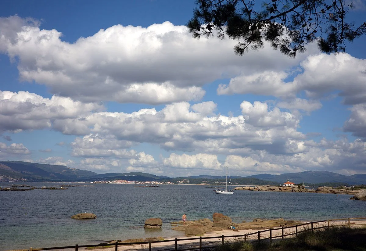
However, when I arrived home and opened the photographs on my computer I was a bit disappointed. Even though all the photographs were correctly exposed, they lacked something. Something that had made that place so breathtakingly beautiful was missing from them.
The cloud shadows on the mountains looked just blue in the photos. There was no hint of that beautiful velvety purple-gray color. Since I remembered the color of the shadows very well I knew that what photographs showed me was far from what my eyes had seen.
The photos seemed too cold, too bluish, but when I tried to change the temperature of the images in the software, they simply gained a yellowish cast. I couldn’t do anything to make them look like the actual place.
This is one of the photos I am talking about.
So, I decided that if I wanted to capture the true colors of that spectacular place, I would have to go to the same beach and paint the view from direct observation.
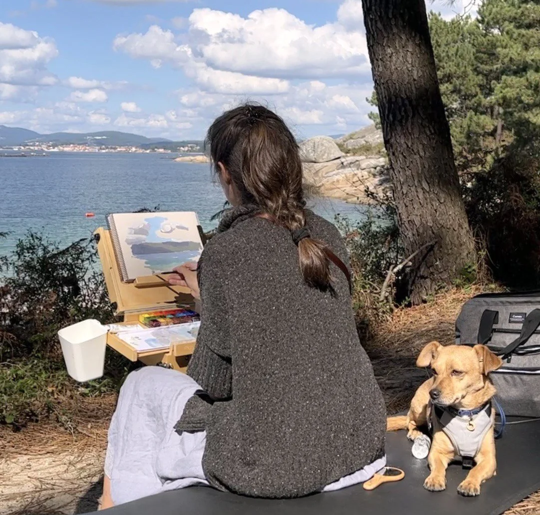
I had to wait for a day with some nice large clouds because, most of all, I wanted to paint those gorgeous dark purple cloud shadows.
A few weeks later, such a day arrived and I drove to Arousa island again and painted the two studies that you can see below. My goal wasn’t to paint a finished piece, instead, I wanted to capture the colors of the landscape as closely as possible to how they looked in reality so that I could use my studies along with my photographs to create larger and more complete paintings in the studio. I didn’t worry about the composition. The colors and values of the shapes were my only concerns.
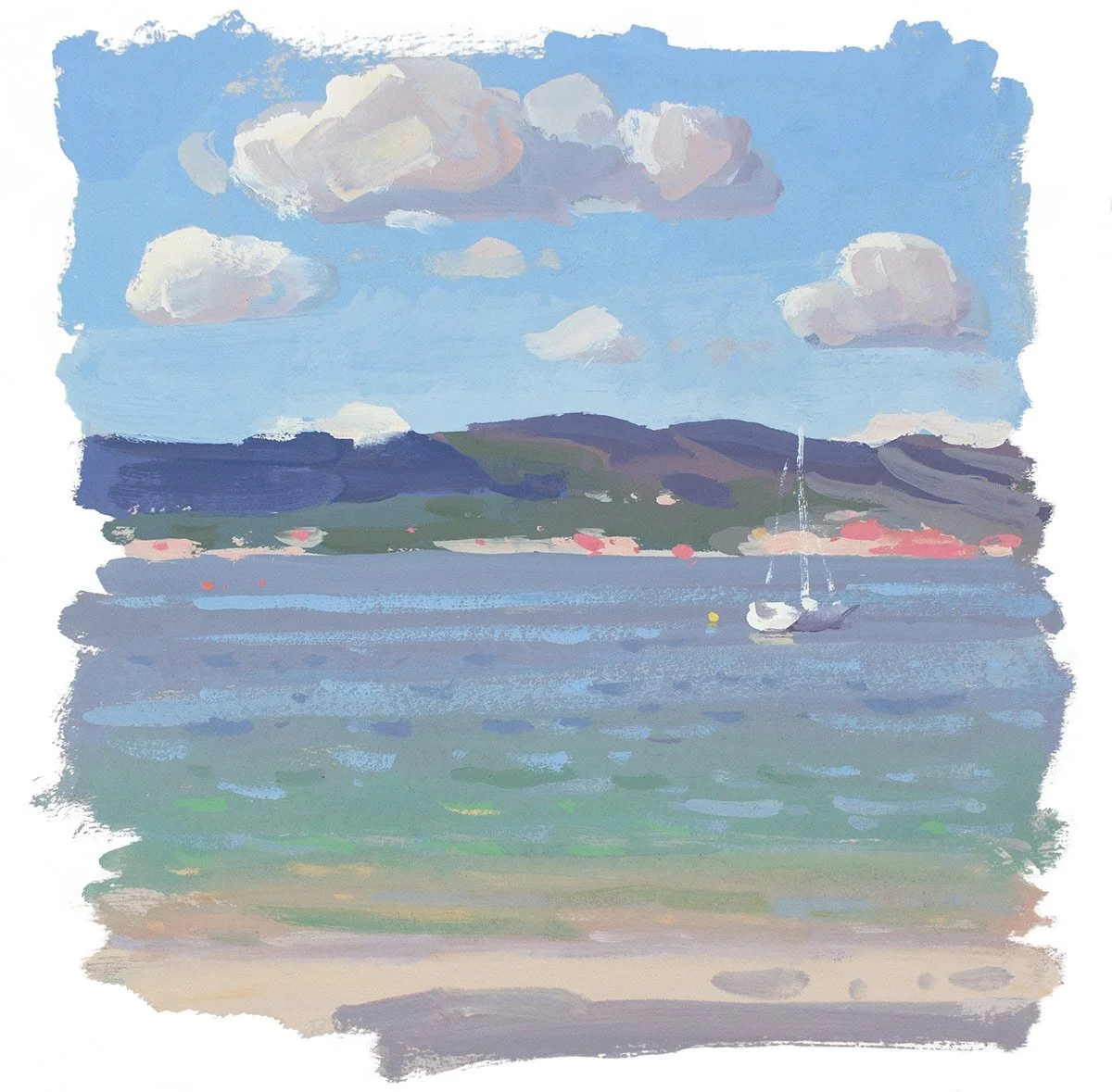
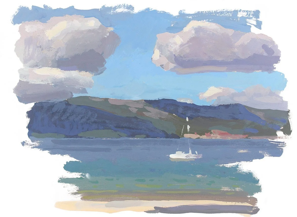
It was windy, the clouds moved and changed shapes rapidly, my colors dried faster than usual on my mixing tray and it was really stressful to work on these two studies. I wanted to pack my setup and drive home several times during that painting session, but every time I had that thought, I remembered the photographs that I couldn’t use without double-checking the colors in my plein air studies that would show me the true hues of that place. So, I kept painting. I am very glad I did because when I came home and put these studies under the bright studio light I said: “Yes, this is all I need. This is what I couldn’t see in my photographs. This warmth, the beautiful dark blue-purple shadows, the green water, and the bright sky. Everything is here, in these simple paintings.”
As you can see, these studies look much warmer than the photograph I have shown you. The warm shades create a nice contrast with the cooler colors which results in a pleasant color vibration similar to the one we experience when looking at a real sunny scene. This vibration of cool and warm colors in a painting is what always speaks to the viewer’s heart.
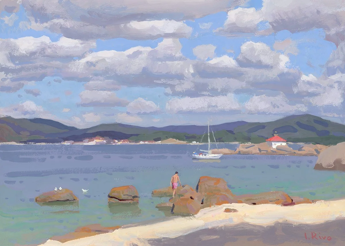
Below is the painting that I painted using the photograph and the two plein air studies. This painting is too complex to have been painted entirely on location but with my reference material, I could calmly paint it in my studio. This is gouache on Arches hot pressed watercolor paper, 9x12 inches.
If you want to see how I painted the two studies and the finished painting shown in this article you can watch the demos on my YouTube channel at the link below:
Study no.1: https://youtu.be/dhBQqonjMrs
Study no. 2: https://youtu.be/45ly1VDmtEo
The studio painting: https://youtu.be/DUjZO3ap_60
This is all for today :) I hope you enjoyed this article.
Lena
P.S. If you enjoyed this article you might also enjoy my free E-Books and painting guides that can be downloaded here: https://www.lenarivo.com/free-guides
Download my free 30-page PDF, “Everything you Need To Know About Gouache”
In this 30-page PDF you will learn:
How to decide which colors you need when you start with gouache and how you can expand your palette to make it even more effective.
What kind of storage palettes to use with gouache to prevent your beautiful colors from fast drying.
Why you need to use two whites with gouache.
How to choose the right paper and what kinds of brushes work best with gouache.
About the setup that I like using for plein air painting with gouache.
You will also be provided with many useful tips that will make your painting experience smoother.