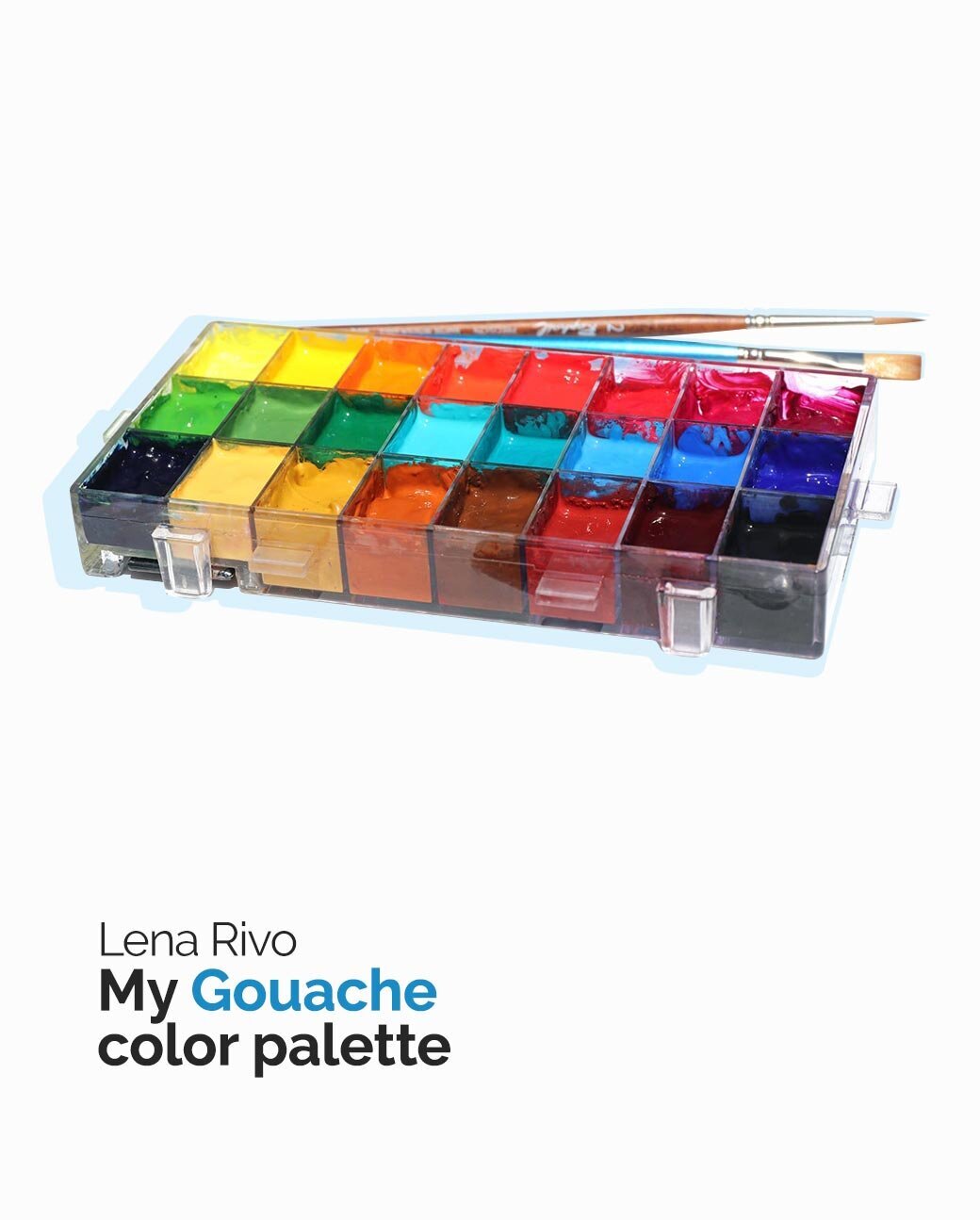
Gouache color palette
I often get asked about my color palette, brushes and the other equipment I use with gouache.
I know it's not always easy to decide what you really need for a better painting experience, so in this article, I will try to help you make your decisions easier and tell you what works for me and why.
Art supply stores are filled with dozens, if not hundreds, of paint tubes with beautiful colors, so how do you decide which ones you really need? The answer is pretty simple - you can mix all those beautiful colors if you pick the right pigments that will allow you to mix any color you see, no matter what the subject is.
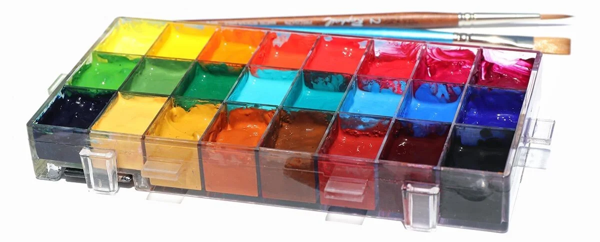
My gouache palette consists of 22 colors. All the colors in my palette are lighter or darker versions of the primary and secondary colors. Each color has a specific purpose and together they not only allow me to mix colors fast, but also keep the colors in my paintings bright and clean. I love my palette and find it extremely convenient to use, but if I had to limit my palette to the maximum, these would be the pigments I would pick:
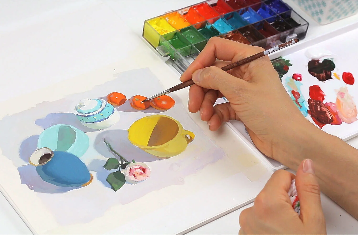
When mixing a color, it is very important for me to be able to control it 100%: its hue, value and saturation. I never use approximate colors in painting. It means that most of the time I have to modify the colors from my palette, making them warmer, cooler, darker, lighter or grayer in order to get exactly the same color I see in the subject. So answering a question I get from time to time, “Do you use colors straight from the tubes?” I can say - only when the color from the tube is exactly what I need. Otherwise, I don't. An important thing to keep in mind when buying paints is how permanent the pigments are. Many of the beautiful colors, especially pinks, lilac colors and violets aren’t lightfast and will fade quickly if you decide to frame your painting. If you store your sketches and paintings in your albums, you don’t need to worry about how permanent the pigments you use are. “Weak” colors will fade only if the painting is exposed to natural light for a long time. I have tried some of these colors, so I will name them here:

As you can see, Opera Pink is literally glowing in this detail
Opera Pink is an astonishingly beautiful, vivid magenta with a bright rose color. This color is amazing. It is made of a fluorescent pigment that you can't really mix using non-fluorescent pigments. That extra glow in fluorescent colors comes from the energy we humans don't see, called ultraviolet light.
If I was an illustrator and only needed to digitize my paintings, I would use fluorescent colors with great pleasure. However, they fade over time and should not be used for work intended to be permanent. These colors from Winsor and Newton brand all belong to the same family of fluorescent colors:
The permanence of a colour is described by Winsor & Newton using the system of AA, A, B and C. The colors marked with AA are extremely permanent and those marked with C are “fugitive”, where fugitive means ‘transient’. Some fugitive colors may fade within months.
For permanent paintings, it is recommended that only AA and A colours are used as these are not expected to fade. Because I sell my paintings and hang them on the walls, I only use colors from these two groups.
So, if you are going to purchase a set of gouache paints, I would recommend starting with a limited palette first, and then expand it with a few other premixed colors.
This is basically all I can tell you about my color palette. As for my favorite brands of gouache, I use traditional gouache from Winsor & Newton and Holbein brands.
They share the same pigments and the quality of gouache of these two brands is excellent. They both don’t use opacifiers, chalks or fillers. It means that their gouache is made up solely of pure concentrated pigment and gum arabic.
Some pigments are opaque and others are transparent, so if some of your gouache colors are transparent, it doesn't mean they are of a low quality.
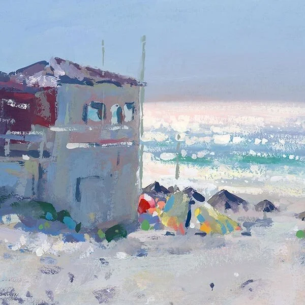
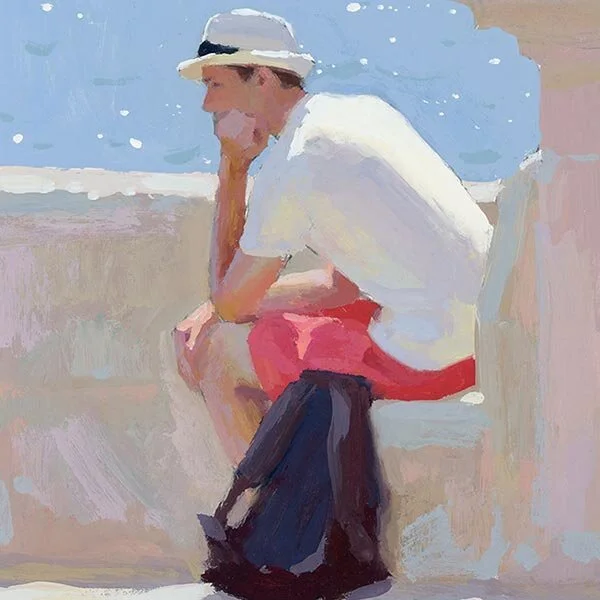
You can use their transparency as an advantage because the contrast between transparent and opaque brushstrokes is one of the most beautiful contrasts used in painting. I use this type of contrast with oils and acrylics all the time, too. Thick opaque brushstrokes over transparent washes create depth and vibrancy in a painting.
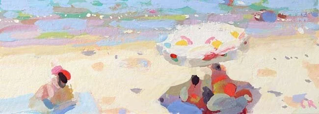
I painted the shadow area under this umbrella using mostly transparent pigments. Everything illuminated by the sun was painted with opaque colors.
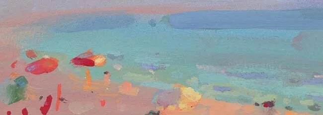
The sky and some other areas in the painting below were painted with transparent pigments. I then overlaid them with some bold brushstrokes using opaque colors.
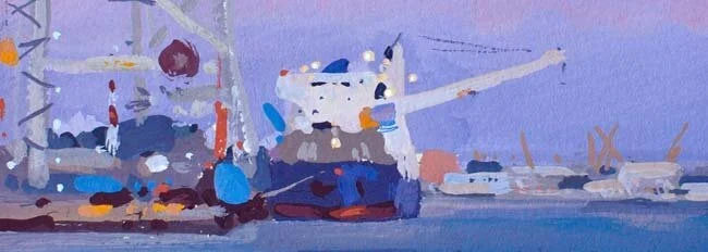
There are no bold brushstrokes here, except for the lights on the ship. The washed and translucent colors suggest that night is approaching.
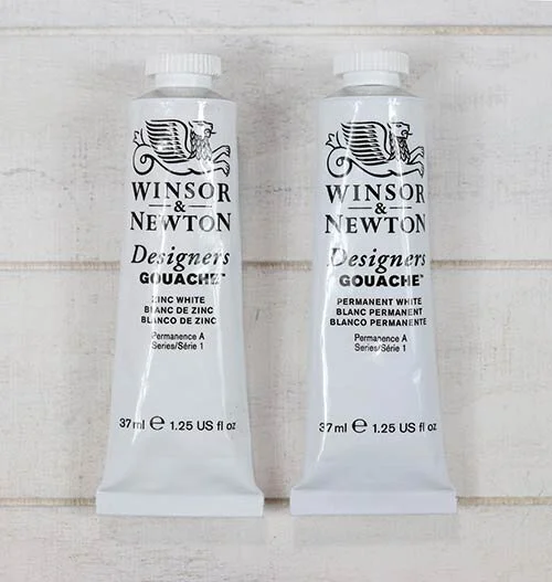
I use two whites with gouache: Zinc White, also known as Chinese White as a mixing white and Titanium White, called Permanent White in gouache for highlights and really light areas. Permanent White can affect the permanence of some pigments, therefore it shouldn't be used as a mixing white.
Download my free 30-page PDF, “Everything you Need To Know About Gouache”
In this 30-page PDF you will learn:
How to decide which colors you need when you start with gouache and how you can expand your palette to make it even more effective.
What kind of storage palettes to use with gouache to prevent your beautiful colors from fast drying.
Why you need to use two whites with gouache.
How to choose the right paper and what kinds of brushes work best with gouache.
About the setup that I like using for plein air painting with gouache.
You will also be provided with many useful tips that will make your painting experience smoother.